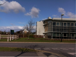
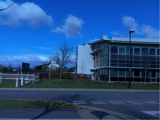
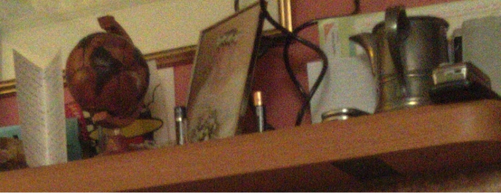
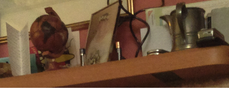
| Liz: here’s the second and final part of David Plowman’s walk through the development of the Raspberry Pi camera board, which will be available to purchase in April. Before you go ahead and read this, check out David’s first post. The Eye of the Beholder That's where beauty lies, so the saying goes. And for all the test charts, metrics and objective measurements that imaging engineers like to throw at their pictures, it's perhaps sobering that the human eye – what people actually like – is the final arbiter of Image Quality (IQ). There has been much discussion, and no little research, on what makes for "good IQ", but the consensus probably has it that while the micro aspects of IQ, such as sharpness, noise and detail, are very important, your eye turns first to the the macro (in the sense of large scale) image features – exposure and contrast, colours and colour balance. We live in a grey world… All camera modules respond differently to red, green and blue stimuli. Of itself this isn't so problematic as the behaviour can be measured, calibrated and transformations applied to map the camera's RGB response (which you saw in the final ugly image of my previous post!) onto our canonical (or standard) notion of RGB. It's in coping with the different kinds of illumination that things get a little tricky. Let me explain. Imagine you're looking at a sheet of white paper. That's just the thing – it's always white. If you're outside on a sunny day, it's white, and if you're indoors in gloomy artificial lighting, it's still white. Yet if you were objectively to measure the colour of the paper with your handy spectrometer, you'd find it wasn't the same at all. In the first case your spectrometer will tell you the paper is quite blue, and in the second, that it's very orange. The Human Visual System has adapted itself brilliantly over millions of years simply not to notice any difference, a phenomenon known as colour constancy. No such luck with digital images, though. Here we have to correct for the ambient illumination to make the colours look "right". Take a look at the two images below. (You’ll find it easier to judge the “right”-ness if you scroll so only one image is on the screen at a time.) It's a scene taken in the Science Park in Cambridge, outside the Broadcom offices. The top one looks fine, but the bottom one has a strong blue cast. This is precisely because the top one has been (in the jargon) white-balanced for an outdoor illuminant and the bottom one for in indoor illuminant. But how do we find the right white balance? The simplest assumption that camera systems can make is that every scene is, on average, grey, and it works surprisingly well. It has some clear limitations too, of course. With the scene above, a "grey world" white balance would actually give a noticeable yellow cast because of the preponderance of blue sky skewing the average. So in reality more sophisticated algorithms are generally employed which constrain the candidate illuminants to a known set (predominantly those a physicist would describe as being radiated by a black body, which includes sunlight and incandescent bulbs), and in keying on colours other than merely grey (often specific memory colours, such as blue sky or skin tones). The devil is in the details… With our colours sorted out, we need to look at the micro aspects of our image tuning. On the Pi, fortunately, we don't have to worry about focusing, which leaves the noise and sharpening filters within the ISP. Note that some amount of sharpening is essential, really, because of the inherent softening effect of the Bayer mosaic that we saw last time. When it comes to tuning noise and detail, there are generally two camps. The first camp regards noise as ugly and tries very hard to eliminate it. The second camp thinks a certain amount of noise is tolerable (it can look a bit like film "grain") in return for better details and a more natural (less processed) look to the image. To see what I mean, take a look at the following three images. It's a small crop from a picture of some objects on a mantelpiece, taken in very gloomy orange lighting, and the walls are even a murky pinkish colour too. Pretty challenging for any digital camera! The top one has had practically no noise filtering applied to it at all. Actually it shows bags of detail, but I think most people would regard the noise as pretty heinous. The second image demonstrates the opposite approach. The noise has been exterminated with extreme prejudice, but out with the bathwater goes the baby – detail and a "natural" looking result. Though my examples are deliberately extreme, you can find the influence of both camps at work in mobile imaging devices today! The final image shows where we've settled with the Pi – a happy medium, I hope, but it does remain, ultimately, a matter of taste. And de gustibus non est disputandum, after all! Happy snapping! I've only grazed the surface of this subject – there are many more niggles and wrinkles that an imaging system has to iron out – but I'm hoping I've given you some sense of why a proper camera integration represents a significant commitment of time and effort. Whilst you're all waiting for the boards finally to become available I'll stick around on this website to answer any questions that I can. My deep thanks, as ever, is due to those clever engineers at Broadcom who actually make this stuff work. David Plowman, March 2013 |
A Semi-automated Technology Roundup Provided by Linebaugh Public Library IT Staff | techblog.linebaugh.org
Wednesday, March 20, 2013
Creating the camera board – part two
Subscribe to:
Post Comments (Atom)


No comments:
Post a Comment